Please note that an original version of this article can be found here.
Introduction
As of lately, several friends of mine tried to convince me to resume writing and this was when I remembered that I apparently once thought so as well when creating this blog. One of those friends happened to be Jon Tennant, dinosaur whisperer from Brexit land and founder of the Open Science MOOC.
In case you have never heard of it, the Open Science MOOC is a free massive open online course hosted on Eliademy. It aims to equip students and researchers with the skills they need to excel in a modern research environment based on Open Science - that is, the broad adoption of good scientific practices as a fundamental and essential part of the research process. The Open MOOC brings together the efforts and resources of hundreds of researchers and practitioners who have all dedicated their time and experience to create a welcoming and supporting community platform.
Along with almost 700 Slack members, we are currently working on a new module on Open Access. While the other Open MOOC-ers are busy collecting resources and setting learning outcomes, I wanted to contribute with what I can do best (other than building dinosaur kits for children): Analyzing them. Because analyzing people is what you do when you like them, right? Is that just me? OK, fair enough.
After realizing that a) I could not get my hands on our Slack analytics due to the free plan and b) being inspired by Shirin Glander’s awesome blog post on characterizing her own Twitter followers, I decided to collect data on all friends and followers of the Open Science MOOC’s official Twitter account.
In this blog post, I am now going to analyze this data in order to answer the following questions:
- Is there an overlap between the Open Science MOOC’s Twitter followers and friends? Who should be immediately unfollowed for not following back?*
- Where are the Open Science MOOC’s twitter followers based? Is there any evidence for a geographically concentrated Open Science Twitter bubble?
- What about diversity among the followers? Does the Open Science MOOC keep its promise of being an inclusive and diverse platform?
- Who are the most influential and active followers? Could they potentially start a revolution, take over the Twitter community, and throw Jon off the Open Science throne?
- What do the followers state in their own profile descriptions? Which institutions are they affiliated with? Which opinions do they express? And last but certainly not least: Do their own texts say anything meaningful about the interests and research activities of the Open Science Twitter MOOC-ers (spoiler alert: yes)?
*Just kidding, of course I skipped this part. But make sure to follow the Open Science MOOC, one never knows what the future might bring… Just kidding again.
Collecting Twitter data
As the old saying goes, every analysis needs its data. While I generally prefer Mike Kearney’s rtweet over twitteR for scraping Twitter data these days, I used the latter for collecting data on all of the N = 5764 followers and N = 4924 friends, i.e. followed accounts, of the Open Science MOOC. The data for this analysis was last retrieved on May 29, 2019.
And while ggplot2 - especially when combined with ggthemes - comes with beautiful themes by default, I most often cannot resist to create a custom theme for each project. With the colour scheme below, I tried to match the visual appearance of Shirin’s follower analysis. And yes, it would have been easier, albeit less fun, if I had followed her example and simply used tidyquant.
# Install and load packages using pacman
if (!require("pacman")) install.packages("pacman")
library(pacman)

p_load(genderizeR, ggraph, igraph, leaflet, magrittr, maps, reshape2, SnowballC, tidytext,
       tidyverse, tmaptools, twitteR, wordcloud, wordcloud2)

# Twitter authentication
options(httr_oauth_cache = TRUE)

setup_twitter_oauth(consumer_key = "[INSERT OWN KEY HERE]",
                    consumer_secret = "[INSERT OWN KEY HERE]",
                    access_token = "[INSERT OWN KEY HERE]",
                    access_secret = "[INSERT OWN KEY HERE]")

# Get information on Open Science MOOC
osci_mooc <- getUser("opensciencemooc")

# Retrieve followers' profile data
osci_followers <- osci_mooc$getFollowers()
data_df <- twListToDF(osci_followers)

# Retrieve friends' profile data
osci_friends <- osci_mooc$getFriends()
friends_df <- twListToDF(osci_friends)

# Set theme
viz_theme <- theme(
  axis.line = element_line(colour = "#2c3e50"),
  axis.text = element_text(colour = "#2c3e50"),
  axis.ticks = element_line(colour = "#85a0bc"),
  legend.key = element_rect(colour = "transparent", fill = "white"),
  panel.border = element_blank(),
  panel.background = element_blank(),
  panel.grid.major = element_blank(),
  panel.grid.minor = element_blank(),
  plot.caption = element_text(colour = "#3e5871"),
  strip.background = element_rect(colour = "#2c3e50", fill = "white"),
  strip.text = element_text(size = rel(1), face = "bold"),
  text = element_text(size = 14, colour = "#2c3e50", family = "Avenir"))
Friend or follow?
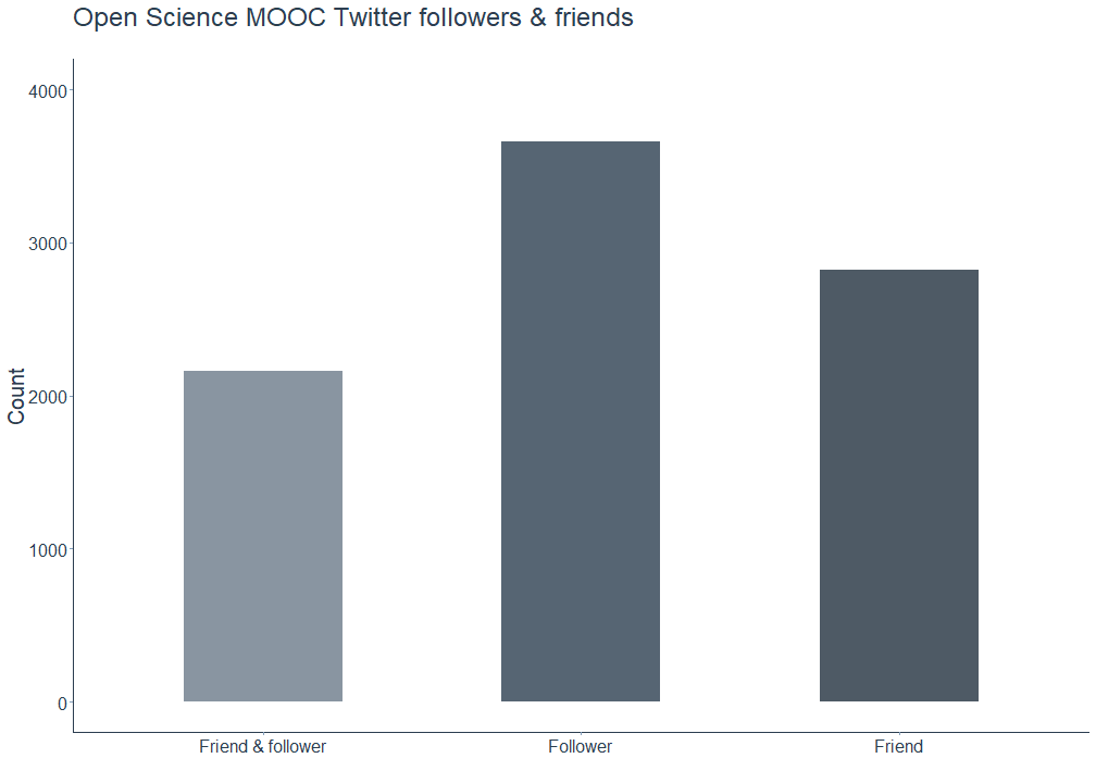
For starters, we can get a simple overview of the total number of friends, followers, and accounts who are friends as well as followers. As can be easily derived from the publicly available statistics on Twitter, the Open Science MOOC account obviously has more followers than friends. Interestingly though, there is quite a large number of accounts the MOOC follows but that do not follow back in return. Yet, over 2000 out of N = 8638 accounts in total are both friends and followers at the same time.
# Merge data frames
relations_df <- rbind(mutate(data_df, relation = ifelse(screenName %in% friends_df$screenName, "both", "follower")),
                              mutate(friends_df, relation = ifelse(screenName %in% data_df$screenName, "both", "friend"))) %>%
  distinct()

# Plot relations
relations_df %>%
  ggplot(mapping = aes(x = relation, fill = relation)) +
  scale_fill_manual(" ", values = c("#6c7a89", "#2C3E50", "#22313f")) +
  scale_x_discrete(labels = c("Friend & follower", "Follower", "Friend")) +
  viz_theme + ylab("Count") + xlab("") +
  geom_bar(alpha = 0.8, width = 0.5) + ylim(0, 4000) +
  ggtitle(label = "Open Science MOOC Twitter followers & friends", subtitle = " ") +
  theme(legend.position = "none")
Locating the Twitter bubble
After this first overview of the Open MOOC-ers Twitter community, let us dive deeper into the whereabouts of the followers. For this purpose, we can use the locations users provide in their Twitter profiles. Not all of the followers did this, but the available information proves to be sufficient for a reasonably accurate overview.
Prior to mapping the locations, however, the unstructured text data needed some basic cleaning by removing mentions, hashtags, and strings either consisting of only one character or containing numbers. In addition, I removed all punctuation except for commas, since locations, if specified correctly (sorry to disappoint you, Jon, Jurassic Park is not a valid location yet [Jon’s comment: Emphasis on “yet”]), are displayed in the city, country format. Lastly, I trimmed both leading and trailing whitespace and converted the preprocessed locations to lower case.
# Clean location
## Note: Code removes locations consisting of non-ASCII characters.
data_df %<>%
  mutate(location_clean = gsub("#\\S+", "", location)) %>% # remove hashtags
  mutate(location_clean = gsub("@\\S+", "", location_clean)) %>% # remove mentions
  mutate(location_clean = gsub("[^[:alnum:][:space:]\\,]", "", location_clean)) %>% # remove punctuation except for commas
  mutate(location_clean = trimws(gsub("\\w*[0-9]+\\w*\\s*", "", location_clean))) %>% # remove words containing numbers
  mutate(location_clean = gsub(" *\\b[[:alpha:]]{1}\\b *", " ", location_clean)) %>% # remove one letter words
  mutate(location_clean = str_trim(location_clean, side = "both")) %>% # remove whitespace
  mutate(location_clean = gsub("^[[:punct:]].*", "", location_clean)) %>% # remove strings starting with comma(s)
  mutate(location_clean = gsub("^$", NA, trimws(location_clean))) %>% # replace blank cells with NA
  mutate(city_clean = str_extract(location_clean, "[^,]+")) %>% # extract string before first comma
  mutate(city_clean = tolower(city_clean))
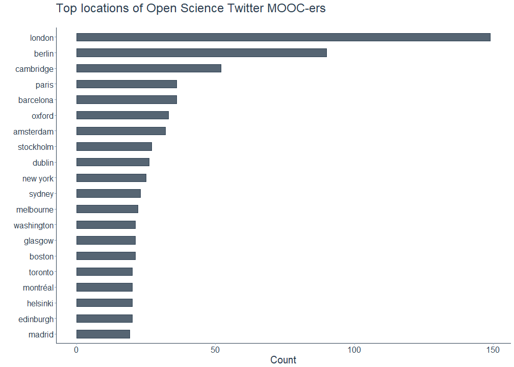
The following plot shows the top locations the Open Science MOOC-ers claimed to be from, after extracting the name of the city from the string and removing unspecific locations like europe or uk. Among the remaining locations are multiple European capital cities, including London, Berlin, Paris, Amsterdam, and Stockholm as well as large US-American and Canadian cities such as New York, Washington, Boston, Toronto or Montréal. Also on the list is Barcelona, a city know for its far-reaching open data policy. However, almost all of the frequently mentioned locations are located in either Western Europe or North America, with Sydney and Melbourne being the Australian exceptions.
# Remove unspecific locations
"%notin%" <- Negate("%in%")
locations_rm <- c("uk", "europe")

# Plot followers' top locations
data_df %>%
  filter(!is.na(city_clean)) %>%
  filter(city_clean %notin% locations_rm) %>%
  count(city_clean, sort = TRUE) %>%
  mutate(city_clean = reorder(city_clean, n)) %>%
  top_n(20, n) %>%
  ggplot(aes(city_clean, n)) +
  geom_bar(stat = "identity", width = 0.5, alpha = 0.8, color = "#2c3e50", fill = "#2c3e50") +
  xlab("") + ylab("Count") + ggtitle("Top locations of Open Science Twitter MOOC-ers", subtitle = " ") +
  coord_flip() + viz_theme
To investigate this interesting finding further, I geocoded all available locations using the OpenStreetMap Nominatim API. The geocode_OSM() function of the tmaptools package is one of the available options for geocoding a location to its coordinates; alternatives are ggmap or opencage. When setting as.data.frame = TRUE, geocode_OSM() returns a data frame containing the latitude and longitude of each location. After obtaining the results, I removed both unspecific (e.g. administrative boundaries) and overly specific locations (e.g. localities or amenities) by filtering all observations that match the type == city condition.
Fun fact: NA, which indicates missing values in R, apparently translates to Norge, Ytterbyvegen, Namsos, Trøndelag, 7810, Norge when geocoding it with OpenStreetMap Nominatim. For a brief moment, I was beyond excited to discover a hidden tribe of Open Science MOOC-ers in this small Norwegian town with oh so beautiful fjords and mountains, but no, this turned out to be nothing but a false positive.
# Geocode cleaned locations
locations_geo <- geocode_OSM(data_df$location_clean, as.data.frame = TRUE, details = TRUE)

# Clean and merge data
locations_df <- locations_geo %>%
  rename(location_clean = query) %>%
  mutate_at(vars(lat, lon), list(~ ifelse(type != "city", NA, .))) %>%
  mutate(display_name = replace(display_name, display_name == "Norge, Ytterbyvegen, Namsos, Trøndelag, 7810, Norge", NA)) %>%
  select(location_clean, display_name, lat, lon)

data_df %<>%
  left_join(locations_df, by = "location_clean") %>%
  distinct()
After eliminating our fake Norwegian community members, OpenStreetMap Nominatim was able to correctly geocode N = 2221 user-provided locations of the Open Science MOOC followers.
The static map below confirms the results of the previous analysis. Most followers who provided a geocodable location tend to be clustered in larger cities in Western Europe and North America. While the map corroborates the idea of a geographically restricted Open Science Twitter bubble, it does not for inferences on what causes this pattern. Potential explanations for this finding could be that users in certain areas such as China have no legal access to Twitter, prefer other online communication platforms or have an actual lack of interest in or knowledge about Open Science. It could also be due to the fact that almost all of the members of the MOOC Steering Committee are based in Western Europe, and thus the MOOC simply replicates this pre-existing geographic bias.
# Get world map
map_world <- map_data("world") %>%
  filter(region != "Antarctica")

# Plot followers' locations
ggplot() +
  geom_polygon(data = map_world, aes(x = long, y = lat, group = group), colour = "gray85", fill = "gray80") +
  geom_point(data = data_df, aes(x = lon, y = lat), color = "#2c3e50", alpha = 0.5) +
  ggtitle(label = "Locations of Open Science Twitter MOOC-ers", subtitle = "Profile locations geocoded with OpenStreetMap Nominatim (N = 2221)") +
  coord_equal() + viz_theme + theme(axis.line = element_blank(),
                    axis.text = element_blank(),
                    axis.title = element_blank(),
                    axis.ticks = element_blank())

In a slightly more advanced version of this map, I added further information on the follower count of the geocoded users, which results in a similar picture: The majority of the influential Open Science Twitter MOOC-ers are based in Western Europe and the United States. I will revisit this notion later on in the blog post when conducting a more fine-grained analysis of the most prominent followers.
# Plot followers' location relative to followers' followers count
ggplot() +
  geom_polygon(data = map_world, aes(x = long, y = lat, group = group), colour = "gray85", fill = "gray80") +
  geom_point(data = data_df, aes(x = lon, y = lat, size = followersCount), color = "#2c3e50", alpha = 0.5) +
  ggtitle(label = "Locations of Open Science Twitter MOOC-ers", subtitle = "Marker sizes relative to followers' followers count (N = 2220)") +
  scale_size_continuous(range = c(1, 6), limits = c(0, 300000),
                        breaks = c(0, 1000, 10000, 100000, 200000, 300000),
                        labels = function(x) format(x, scientific = FALSE)) +
  labs(size = "Number of followers' followers") + coord_equal() +
  viz_theme + theme(legend.position = "none",
                    axis.line = element_blank(),
                    axis.text = element_blank(),
                    axis.title = element_blank(),
                    axis.ticks = element_blank())

The static maps above can be supplemented by creating an interactive map using leaflet, which allows to zoom into all areas and take a closer look at specific countries and regions.
# Plot followers' locations using leaflet
leaflet(data_df, width = "100%") %>%
  addProviderTiles("CartoDB.DarkMatter") %>%
  addCircleMarkers(~lon,
                   ~lat,
                   color = "#9eb4ca",
                   radius = 1.5)
Diversity and inclusion
After tracking down their locations, I was interested in the gender diversity of the Open Science MOOC followers since one of its objectives is to be an inclusive and welcoming platform for people of all nationalities and genders.
“How does this work with Twitter data where no information on users’ genders is available?” you might ask. Excellent question. A while ago I worked on a project using bibliometric data to analyze gender differences in computational social science publications (that in the end sadly never saw the light of the day) and stumbled upon genderize.io. Their API draws on a database containing over 200,000 distinct names from 79 countries and 89 languages which were obtained from user profiles across various social networks to determine people’s gender based on their first name. While this approach only allows for qualified guesses rather than perfectly robust results, it still provides a rough estimate of the gender distribution among the Open Science MOOC-ers.
Before determining each followers gender, I preprocessed all names by again removing hashtags, mentions, punctuation, numbers, and non-ASCII characters - yes, people on Twitter are amazingly creative when it comes to their online identities - as well as academic titles such as Dr, PhD or Prof.
# Clean name and split name into first and last name
## Note: Names consisting of non-ASCII characters are removed.
data_df %<>%
  mutate(name_clean = gsub("#\\S+", "", name)) %>%
  mutate(name_clean = gsub("@\\S+", "", name_clean)) %>%
  mutate(name_clean = gsub("[^\x01-\x7F]", "", name_clean)) %>% # remove non-ASCII characters
  mutate(name_clean = gsub("[^[:alnum:][:space:]\\-]", "", name_clean)) %>%
  mutate(name_clean = gsub("^[[:punct:]]", "", name_clean)) %>%
  mutate(name_clean = trimws(gsub("\\w*[0-9]+\\w*\\s*", "", name_clean))) %>%
  mutate(name_clean = gsub(" *\\b[[:alpha:]]{1}\\b *", " ", name_clean)) %>%
  mutate(name_clean = gsub("Dr\\s*", "", name_clean), name_clean = gsub("PhD\\s*", "", name_clean),
         name_clean = gsub("Prof\\s*", "", name_clean), name_clean = gsub("MSc\\s*", "", name_clean),
         name_clean = gsub("MA\\s*", "", name_clean), name_clean = gsub("MD\\s*", "", name_clean)) %>%
  mutate(name_clean = str_trim(name_clean, side = "both")) %>%
  mutate(name_clean = gsub("^$", NA, trimws(name_clean))) %>%
  separate(name_clean, c("first_name", "last_name"), sep = " ", remove = FALSE)
Prior to predicting the Open Science MOOC followers’ genders with genderizeR - a package accesses the genderize.io API from within R - I drew a random sample of N = 1000 followers with non-missing first names as the free API is limited to classifying 1000 names per day.
# Draw random sample of followers
set.seed(42)
df_sample <- data_df %>%
  filter(!is.na(first_name)) %>%
  sample_n(1000)

# Predict and genderize names
givenNames <- findGivenNames(df_sample$first_name, progress = FALSE)
followers_gender <- genderize(df_sample$first_name, genderDB = givenNames, progress = FALSE)
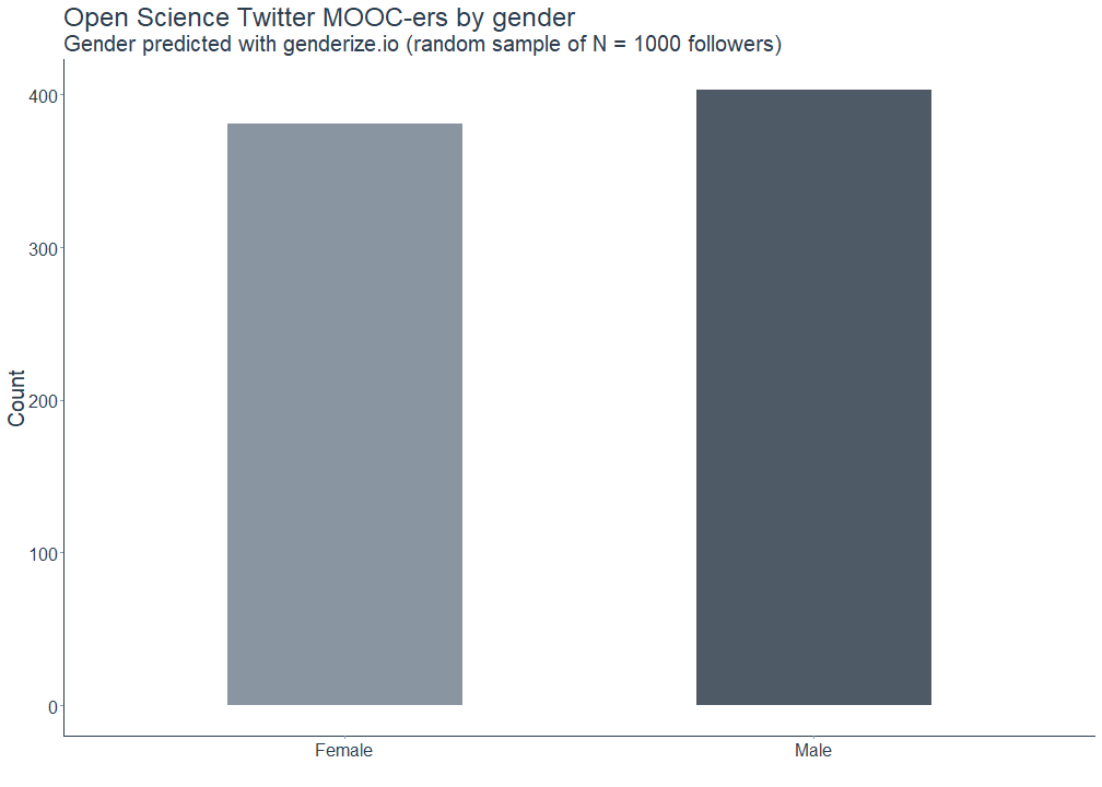
The following plot shows the gender demographics of the sampled followers. The genderize.io API confidently classified 403 first names as male and 381 as female. 216 names could not be classified and thus resulted in missing values. Hence, there tend to be slightly more male than female followers, but overall it is pretty balanced.
# Merge with main data frame and change gender for "NA" to NA
data_df %<>%
  left_join(followers_gender, by = c("first_name" = "text")) %>%
  select(-genderIndicators) %>%
  mutate(gender = replace(gender, gender == "NA", NA)) %>%
  distinct()

# Plot gender distribution using genderized data
followers_gender %>%
  mutate(gender = replace(gender, gender == "NA", NA)) %>%
  filter(!is.na(gender)) %>%
  ggplot(mapping = aes(x = gender, fill = gender)) +
  scale_fill_manual(" ", values = c("#6c7a89", "#22313f")) +
  scale_x_discrete(labels = c("Female", "Male")) +
  viz_theme + ylab("Count") + xlab("") +
  geom_bar(alpha = 0.8, width = 0.5) +
  ggtitle(label = "Open Science Twitter MOOC-ers by gender", subtitle = "Gender predicted with genderize.io (random sample of N = 1000 followers)") +
  theme(legend.position = "none")
To get a better picture of how inclusive the Open Science MOOC Twitter community is, I additionally classified all followers based on their respective account status. This approach was adapted from a blog post on analyzing social movements on Twitter that I co-wrote with my fellow CorrelAider Konstantin Gavras for the European elections in May 2019.
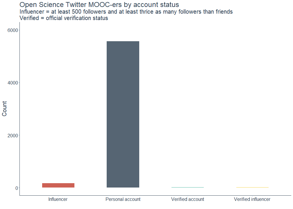
All followers of the Open Science MOOC were classified as follows: (1) Verified account: Account is officially verified by Twitter (i.e. of public interest) (2) Influencer: Account has at least 500 followers and at least thrice as many followers than friends (3) Verified influencer: Account is both officially verified and classified as an influencer (4) Personal account: Account is neither verified nor classified as an influencer
As can be seen in the plot below, most accounts are unverified personal ones, making the Open Science MOOC Twitter community a very inclusive digital space.
# Add influencer status
## Approach adapted from https://correlaid.org/blog/we2-twitter-analysis/.
data_df$influencer <- ifelse(data_df$followersCount >= 500 & data_df$followersCount >= 3 * data_df$friendsCount, 'YES', 'NO')

# Classify accounts into differenct user categories based on verification status and influencer status
data_df$category <- ifelse(data_df$verified == FALSE & data_df$influencer == 'YES', 'influencer',
                           ifelse(data_df$verified == TRUE & data_df$influencer == 'NO', 'verified',
                                  ifelse(data_df$verified == TRUE & data_df$influencer == 'YES', 'verified_influencer', 'personal')))

# Plot number of accounts by status category
## Credits: Colors taken from https://www.colorcombos.com/color-schemes/554/ColorCombo554.html.
data_df %>%
  select(screenName, category) %>%
  unique() %>%
  ggplot(mapping = aes(x = category, fill = category)) +
  scale_fill_manual(" ", values = c("#C0392B", "#2C3E50", "#16A085", "#F1C40F")) +
  scale_x_discrete(labels = c("Influencer", "Personal account", "Verified account", "Verified influencer")) +
  viz_theme + ylab("Count") + xlab("") +
  geom_bar(alpha = 0.8, width = 0.5) +
  ggtitle(label = 'Open Science Twitter MOOC-ers by account status', subtitle = "Influencer = at least 500 followers and at least thrice as many followers than friends \nVerified = official verification status") + ylim(0, 6000) +
  theme(legend.position = "none")
Followers or leaders?
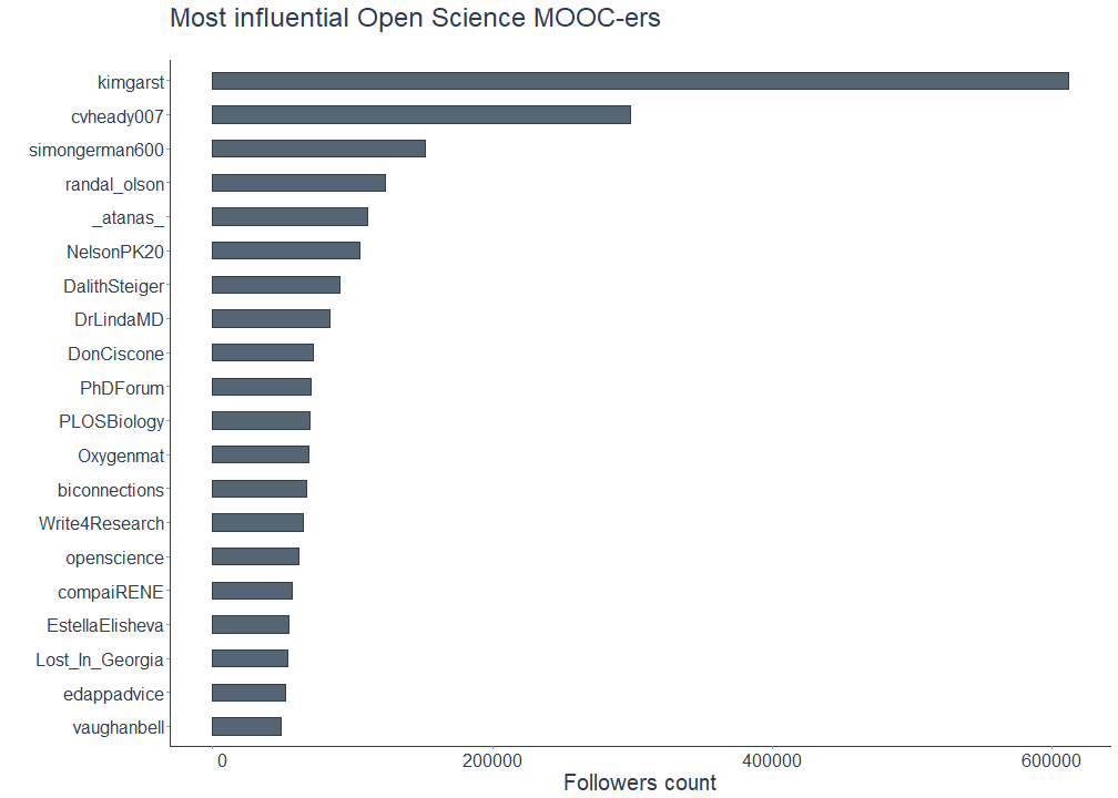
Now that we have seen that there are only few verified accounts and influencers being part of the community, who are the followers with the largest follower base? Here you have an overview of the most influential Open Science MOOC-ers:
# Plot most influential followers
data_df %>%
  top_n(20, followersCount) %>%
  mutate(screenName = reorder(screenName, followersCount)) %>%
  ggplot(aes(screenName, followersCount, label = followersCount)) +
  geom_bar(stat = "identity", width = 0.5, alpha = 0.8, color = "#2c3e50", fill = "#2c3e50") +
  xlab("") + ylab("Followers count") + ggtitle("Most influential Open Science MOOC-ers", subtitle = " ") +
  scale_y_continuous(labels = function(x) format(x, scientific = FALSE)) +
  coord_flip() + viz_theme
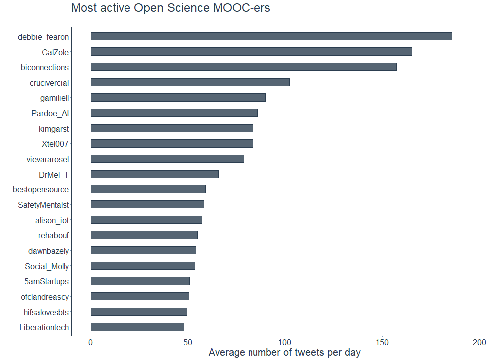
To get a more detailed picture, let us also have a look at the most active followers. Here, I followed Shirin’s example and normalized the number of statuses, meaning tweets and retweets, each account shared by the number of days the account existed.
# Calculate each follower's average number of tweets per day
## Approach adapted from https://shiring.github.io/text_analysis/2017/06/28/twitter_post.
data_df %<>%
  mutate(created_date = as.Date(created, format = "%Y-%m-%d"),
         today = as.Date("2019-05-28", format = "%Y-%m-%d"),
         days = as.numeric(today - created_date),
         statuses_day = statusesCount / days) %>%
  select(-today)

# Plot most active followers
data_df %>%
  top_n(20, statuses_day) %>%
  mutate(screenName = reorder(screenName, statuses_day)) %>%
  ggplot(aes(screenName, statuses_day, label = statuses_day)) +
  geom_bar(stat = "identity", width = 0.5, alpha = 0.8, color = "#2c3e50", fill = "#2c3e50") +
  xlab("") + ylab("Average number of tweets per day") + ggtitle("Most active Open Science MOOC-ers", subtitle = " ") +
  scale_y_continuous(labels = function(x) format(x, scientific = FALSE)) + ylim(0, 200) +
  coord_flip() + viz_theme
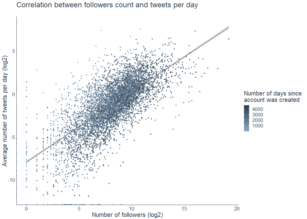
And yes, there is a correlation between the number of followers and the number of tweets, indicating that Open Science MOOC-ers with many followers also tend to tweet more often.
data_df %>%
  ggplot(aes(x = log2(followersCount), y = log2(statuses_day), color = days)) +
    geom_smooth(method = "lm", color = "grey50", fill = "grey90", alpha = 0.8) +
    geom_point(alpha = 0.8) +
  scale_color_continuous("Number of days since \naccount was created", low = "#91aac3", high = "#2C3E50") +
    xlab("Number of followers (log2)") + ylab("Average number of tweets per day (log2)") + ggtitle("Correlation between followers count and tweets per day", subtitle = " ") +
    viz_theme
Activities, interests, and opinions
After these insights into the locations and demographics of the Open Science Twitter MOOC-ers, we now analyze the contents of their own profile descriptions.
You guessed correctly, these unstructured texts need some preprocessing as well. In this case, preprocessing translates to removing URLS, punctuation, non-alphabetic characters, leading and trailing whitespace as well as English, German, French, and Spanish stopwords. \@-mentions and hashtags are intentionally kept since they are parts of the actual analysis. Profile descriptions originally consist of a sequence of strings and after cleaning them, I split them into single words. This process is called tokenization in natural language processing.
I also stemmed these preprocessed words using Martin Porter’s stemming algorithm for collapsing words to a common root. This was done with the SnowballC package to help facilitate comparison between followers’ vocabulary. Alternatively, I also tried lemmatization with textstem, that is removing inflectional endings and grouping words into a single base form (the so-called lemma), but I was not too happy with the results. So in the end I just went with stemming.
# Get German, French, and Spanish stop words
stop_german <- data.frame(word = stopwords::stopwords("de"), stringsAsFactors = F)
stop_french <- data.frame(word = stopwords::stopwords("fr"), stringsAsFactors = F)
stop_espanol <- data.frame(word = stopwords::stopwords("es"), stringsAsFactors = F)

# Specify pattern for tokenization
## Regex adapted from https://pushpullfork.com/mining-twitter-data-tidy-text-tags/.
pattern_words <- "([^A-Za-z_\\d#@]|'(?![A-Za-z_\\d#@]))"

# Tidy descriptions
desc_tidy <- data_df %>%
  mutate(description_clean = gsub("^$", NA, trimws(description))) %>%
  mutate(description_clean = gsub("http\\S+\\s*", "", description_clean)) %>% # remove URLS
  unnest_tokens(word, description_clean, token = "regex", pattern = pattern_words) %>%
  filter(!word %in% stop_words$word, !word %in% stop_german$word, !word %in% stop_french$word,
         !word %in% stop_espanol$word, str_detect(word, "[a-z]")) %>% # remove stop words
  mutate(word_stem = wordStem(word)) %>% # stem words
  select(word, word_stem, screenName)
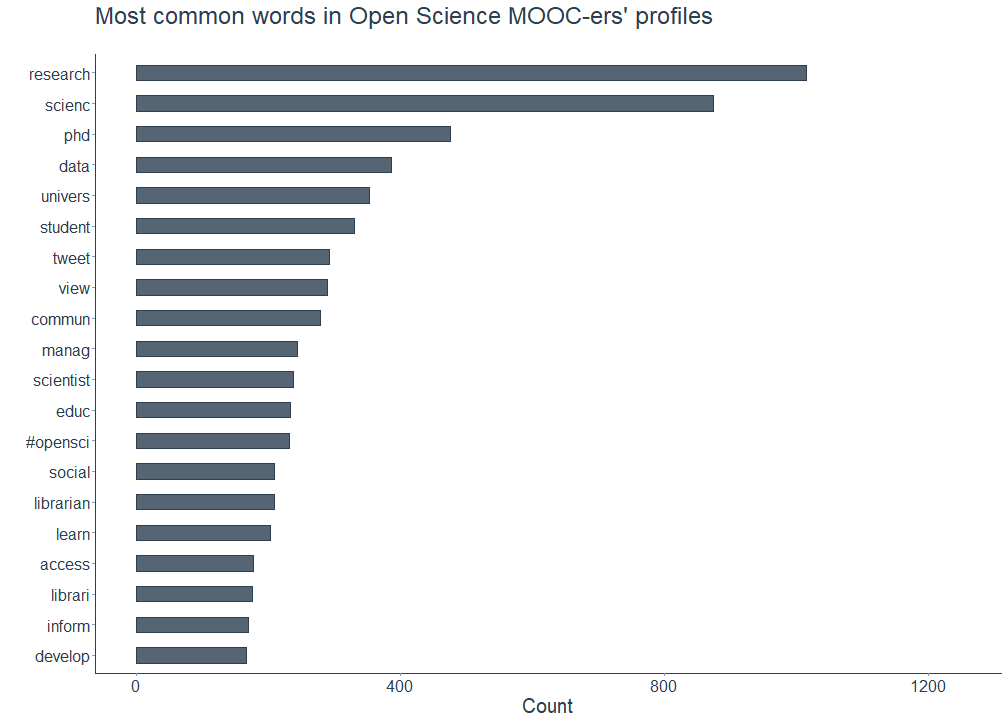
In a first step, I filtered the most common words the Open Science MOOC followers used in their profile descriptions. The plot below shows that words referring to all things science (e.g. research, scienc, data, scientist), academia (e.g. phd, univers, student) or non-academic professions (manag, librarian) are among the most common ones. Followers also seem to frequently include words describing their activities (e.g. learn, develop) or words pointing towards the principles of Open Science (#opensci, access) in their profiles. Using a word cloud, I corroborate these findings by mapping the 100 most common words.
# Plot most common words in followers' descriptions
desc_tidy %>%
  count(word_stem, sort = TRUE) %>%
  top_n(20, n) %>%
  ggplot(aes(x = reorder(word_stem, n), y = n)) +
  geom_bar(stat = "identity", width = 0.5, alpha = 0.8, color = "#2c3e50", fill = "#2c3e50") +
  ylab("Count") + xlab("") +
  ggtitle(label = "Most common words in Open Science MOOC-ers' profiles", subtitle = " ") + ylim(0, 1250) +
  coord_flip() + viz_theme
# Plot word cloud
desc_tidy %>%
  count(word_stem, sort = TRUE) %>%
  top_n(100, n) %>%
  wordcloud2(color = "#2c3e50")

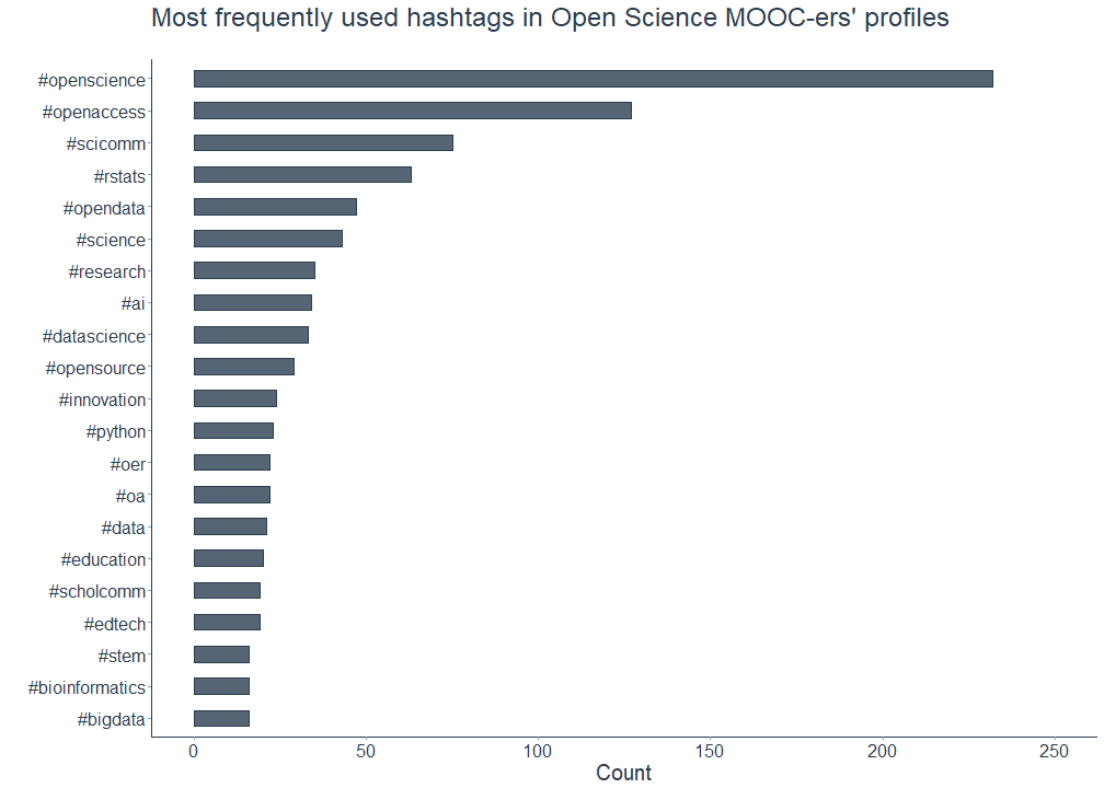
The word cloud above shows that at least two well-known hashtags, #opensci and #openaccess, are prominently featured in the Open Science Twitter MOOC-ers profiles. Are there any other hashtags that are also frequently mentioned?
Yes, indeed. Not surprisingly, #openscience comes first in this list (guilty as charged for having this in my own profile description as well), followed by #openaccess and #scicomm. Honorable mentions go to multiple other hashtags referring to the various branches of Open Science: #opendata, #opensource, #oer - which is short for Open Educational Resources - and #oa, denoting #openaccess.
On a personal and admittedly slightly judgmental note, I’m proud of the Open Science MOOC-ers for mentioning #rstats more often than #python. Despite using both programming languages in my work, my heart still belongs to the former - come for the data (science), stay for the awe-inspiRing community. Though to be fair and potentially burst my own bubble, there are other hashtags like #pydata that Pythonistas use alternately.
# Plot most common hashtags in MOOC-ers profiles
desc_tidy %>%
  filter(str_detect(word, "#\\S+")) %>% # filter hashtags
  count(word, sort = TRUE) %>%
  mutate(word = reorder(word, n)) %>%
  top_n(20, n) %>%
  ggplot(aes(word, n)) +
  geom_bar(stat = "identity", width = 0.5, alpha = 0.8, color = "#2c3e50", fill = "#2c3e50") +
  xlab("") + ylab("Count") + ggtitle("Most frequently used hashtags in Open Science MOOC-ers' profiles", subtitle = " ") +
  coord_flip() + viz_theme + ylim(0, 250)
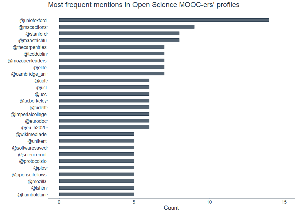
In addition to the hashtags, I looked at the \@-mentions in the Open Science MOOC-ers Twitter profiles as well. Among the most common mentions of the followers are (presumably) their respective past and current institutional affiliations. Here, the universities Oxford, Stanford and Maastricht were mentioned quite frequently.
Other profiles include mentions of research fellowship or online programmes such as the Marie Skłodowska-Curie Actions program of the EU (\@mscactions), the Fellows Freies Wissen Open Science program funded by Wikimedia, the Stifterverband, and VolkswagenStiftung (\@openscifellows) as well as the Mozilla Open Leaders program by Mozilla (\@mozopenleaders).
Lastly, there are also mentions indicating affiliations with institutions which devote (parts of) their efforts to Open Science, namely The Carpentries, an open global community for teaching foundational coding and data science skills, or eLife, an open-access journal for research in the life and biomedical sciences.
# Plot most common mentions in MOOC-ers profiles
desc_tidy %>%
  filter(str_detect(word, "@\\S+")) %>% # filter mentions
  count(word, sort = TRUE) %>%
  mutate(word = reorder(word, n)) %>%
  top_n(20, n) %>%
  ggplot(aes(word, n)) +
  geom_bar(stat = "identity", width = 0.5, alpha = 0.8, color = "#2c3e50", fill = "#2c3e50") +
  xlab("") + ylab("Count") + ggtitle("Most frequent mentions in Open Science MOOC-ers' profiles", subtitle = " ") + ylim(0, 15) +
  coord_flip() + viz_theme
Up to this point, the content analysis relied on words as individual units. Since we’re also interested in extracting co-occurring words or word sequences (examples might be phd student or data science), we now go one step further and analyze the relationship between two consecutive words by tokenizing the profile texts into pairs of adjacent words, called bigrams.
# Clean descriptions (again) and get bigrams
bigrams_tidy <- data_df %>%
  mutate(description_clean = gsub("^$", NA, trimws(description))) %>%
  mutate(description_clean = gsub("http\\S+\\s*", "", description_clean)) %>%
  unnest_tokens(bigram, description_clean, token = "ngrams", n = 2) %>%
  separate(bigram, c("word1", "word2"), sep = " ") %>%
  filter(!word1 %in% stop_words$word, !word1 %in% stop_german$word, !word1 %in% stop_french$word,
         !word1 %in% stop_espanol$word, !word2 %in% stop_words$word, !word2 %in% stop_german$word, !word2 %in% stop_french$word, !word2 %in% stop_espanol$word)
The following plot shows the bigrams that the Open Science MOOC-ers most frequently include in their Twitter profiles.
While several bigrams seem to point to their academic and non-academic positions (e.g. phd student/candidate, assistant professor, data scientist, associate professor, research fellow, project manager), other bigrams presumably describe the followers’ professional interests, for instance scholarly communication, machine learning, data management or digital humanities.
# Plot most common bigrams
bigrams_tidy %>%
  count(word1, word2, sort = TRUE) %>%
  unite(bigram, c("word1", "word2"), sep = " ") %>%
  filter(bigram != "NA NA") %>%
  top_n(20, n) %>%
  ggplot(aes(x = reorder(bigram, n), y = n)) +
  geom_bar(stat = "identity", width = 0.5, alpha = 0.8, color = "#2c3e50", fill = "#2c3e50") +
  xlab("") + ylab("Count") + ggtitle("Most common bigrams in Open Science MOOC-ers' profiles", subtitle = " ") + ylim(0, 200) +
  coord_flip() + viz_theme

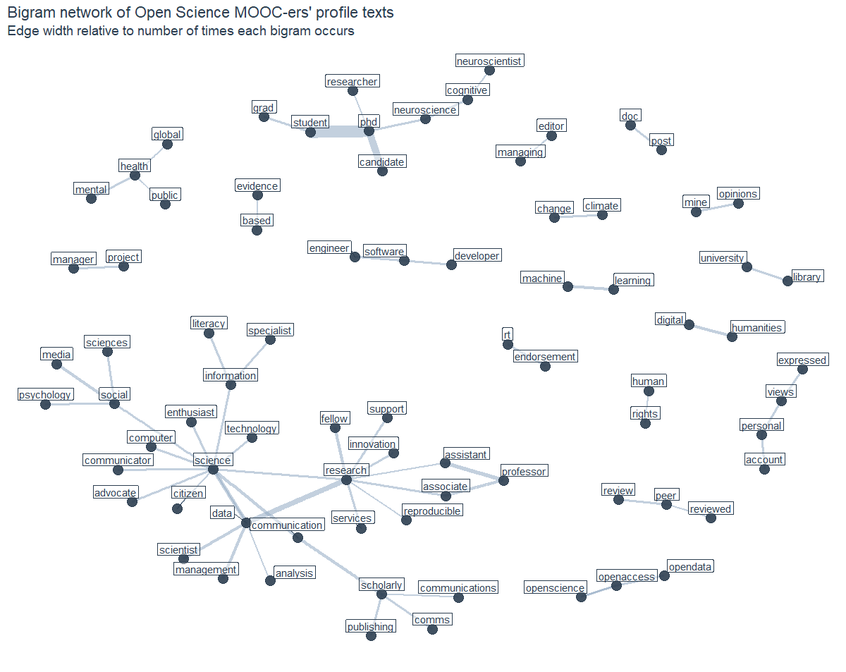
These bigram counts can also be transformed into a graph object and visualized as a bigram network, with the nodes and edges being defined as follows: The source is the first word and the target is the second word in a pair of consecutive words. Edges are the connections between two nodes whenever both words co-occurred at least ten times in the followers’ profile descriptions. This threshold was chosen for visual reasons in order to make the depicted bigrams easier to read. The width of the edges reflects how common or rare each bigram is.
Compared to the previous results, the bigram network allows for a deeper insight into the interests and activities of the Open Science Twitter MOOC-ers. As expected, common nodes in the network are research (often followed by an academic position), data, science and phd. Other pairs and triplets mention societal challenges such as human rights, mental health or global/public health, indicating an increased awareness for social issues within the community. Some followers also make clear that they tweet from personal accounts and that the views they express are their own and retweets are not necessarily endorsements. But see for yourself:
# Calculate bigram counts and transform into graph object
bigram_graph <- bigrams_tidy %>%
  count(word1, word2, sort = TRUE) %>%
  na.omit() %>%
  filter(n > 10) %>%
  graph_from_data_frame()

# Plot bigram network
ggraph(bigram_graph, layout = "nicely") +
  geom_edge_link(aes(edge_alpha = 0.1, width = n), color = "#91aac3", show.legend = FALSE) +
  geom_node_point(color =  "#2c3e50", size = 5, alpha = 0.9) +
  geom_node_label(aes(label = name), vjust = 1, hjust = 0.5, label.size = 0.05,
                  label.padding = unit(0.15, "lines"), label.r = 0.05, fill = "#ffffff66",
                  color = "#2c3e50", repel = TRUE) +
  ggtitle("Bigram network of Open Science MOOC-ers' profile texts", subtitle = "Edge width relative to number of times each bigram occurs") +
  viz_theme + theme(axis.line = element_blank(),
                    axis.text = element_blank(),
                    axis.title = element_blank(),
                    axis.ticks = element_blank())
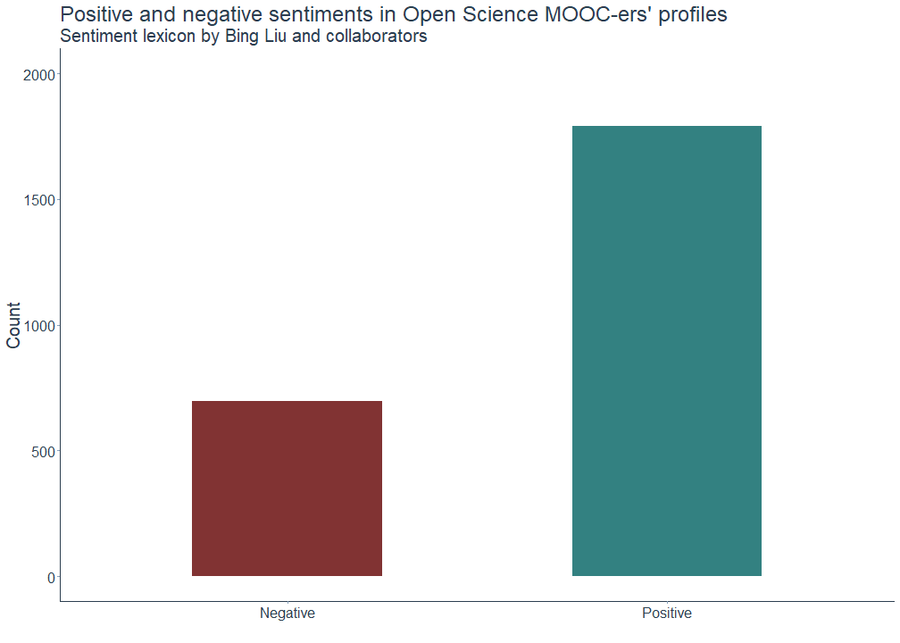
The final part of this analysis deals with the sentiments conveyed in the Open Science MOOC-ers profile descriptions. The sentiment analysis below is based on a dictionary approach using Bing Liu et al.’s sentiment lexicon. This dictionary contains approximately 6800 English sentiment words that were classified according to whether they have a positive or negative connotation, along with their assigned numerical values. These lists can then be used to match the words that followers use in their profile description with those included in the dictionary.
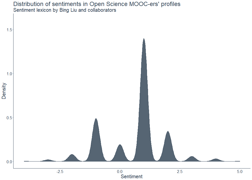
The following plots show, first, the total number of positive and negative sentiments and, second, the sentiment distribution. As we can see here, the overall sentiment of the followers’ profile descriptions is mostly positive, meaning that the texts contain more positively than negatively connotated words. Please note that I excluded the word endorsement from the analysis.
# Remove the following terms
senti_rm <- "endorsement"

# Calculate and plot total sentiment scores (bing)
desc_tidy %>%
  filter(word %notin% senti_rm) %>%
  inner_join(get_sentiments("bing"), by = "word") %>%
  count(word, sentiment) %>%
  ggplot(aes(sentiment, n)) +
  geom_bar(aes(fill = sentiment), stat = "identity", alpha = 0.8, width = 0.5) +
  scale_fill_manual(values = c("#620000","#006262")) +
  scale_x_discrete(labels = c("Negative", "Positive")) +
  xlab("") + ylab("Count") + ggtitle("Positive and negative sentiments in the Open Science MOOC-ers' profiles", subtitle = "Sentiment lexicon by Bing Liu and collaborators") + ylim(0, 2000) +
  theme(legend.position = "none") + viz_theme
# Plot sentiment distribution
desc_tidy %>%
  filter(word %notin% senti_rm) %>%
  inner_join(get_sentiments("bing"), by = "word") %>%
  count(screenName, word, sentiment) %>%
  group_by(screenName, sentiment) %>%
  summarise(sum = sum(n)) %>%
  spread(sentiment, sum, fill = 0) %>%
  mutate(difference = positive - negative) %>%
  ggplot(aes(x = difference)) +
  geom_density(color = "#2c3e50", fill = "#2c3e50", alpha = 0.8) +
  xlab("Sentiment") + ylab("Density") + ggtitle("Distribution of sentiments in Open Science MOOC-ers' profiles", subtitle = "Sentiment lexicon by Bing Liu and collaborators") + ylim(0, 1.6) +
  viz_theme
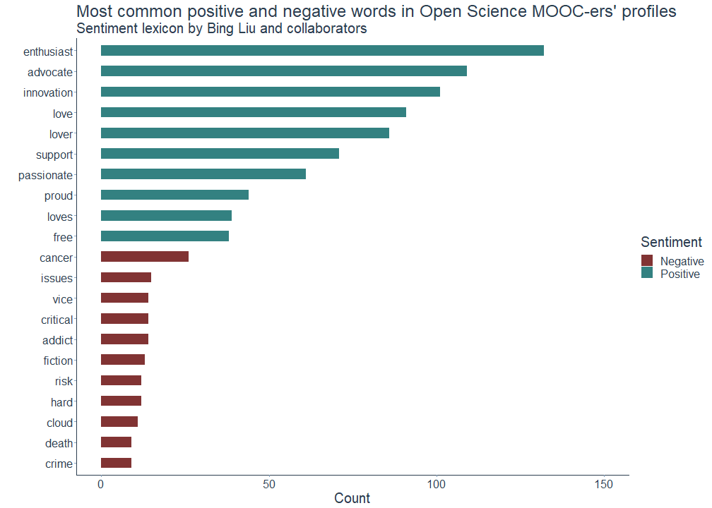
But which words are actually classified as positive and negative? The following overview shows that several of the words the Open Science MOOC-ers presumably use to describe both themselves (e.g. enthusiast, advocate, lover) and their preferences and characteristics (e.g. love(s), passionate, proud) are among the most frequently used positive words in their profile descriptions. Negative words include for instance the word cancer, which may either indicate the respective followers’ own research interests, zodicac signs or possibly refer to their own medical history.
# Plot most common positive and negative words
desc_tidy %>%
  filter(word %notin% senti_rm) %>%
  inner_join(get_sentiments("bing"), by = "word") %>%
  count(word, sentiment, sort = TRUE) %>%
  group_by(sentiment) %>%
  top_n(10, n) %>%
  ungroup() %>%
  mutate(word = reorder(word, n)) %>%
  ggplot(aes(word, n)) +
  geom_bar(stat = 'identity', aes(fill = sentiment), width = 0.5, alpha = 0.8) +
  scale_fill_manual(name = "Sentiment",
                    labels = c("Negative", "Positive"),
                    values = c("negative" = "#620000", "positive" = "#006262")) +
  xlab("") + ylab("Count") + ggtitle("Most common positive and negative words in Open Science MOOC-ers' profiles", subtitle = "Sentiment lexicon by Bing Liu and collaborators") +
  viz_theme + coord_flip() + ylim(0, 150)
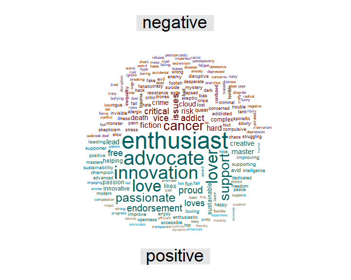
To get a broader picture of the most common positive and negative words, they can also be visualize in a comparison cloud.
# Plot comparison cloud
desc_tidy %>%
  inner_join(get_sentiments("bing"), by = "word") %>%
  count(word, sentiment, sort = TRUE) %>%
  acast(word ~ sentiment, value.var = "n", fill = 0) %>%
  comparison.cloud(colors = c("#620000", "#006262"),
                   max.words = 200)
Conclusion
So what does this analysis tell us about the Open Science MOOC Twitter community? The findings demonstrate that a substantial number of followers of the official account are based in larger cities across Western Europe and North America. Hence, there is some evidence for the Open Science Twitter bubble being geographically clustered. Still, the Open Science MOOC-ers seem to be a diverse and inclusive community overall as both genders are represented almost equally and most followers tweet from unverified personal accounts. When it comes to the professional activities of the community members, they tend to either be PhD students, hold more senior academic positions or seem to work in closely related fields such as data science or science communication. Moreover, several followers are officially affiliated with universities, others with national and international Open Science fellowship programs or organization promoting Open Science. Many followers also actively spread the values and principles of Open Science by including hashtags referring to the various branches of Open Science - including Open Access, Open Data, Open Source, and Open Educational Resources - in their profile descriptions, which mostly convey positive sentiments.
Taken together, the empirical results strongly indicate that the Open Science Twitter MOOC-ers are indeed a bunch of enthusiastic, diverse, and highly-educated science afficionados who dedicate their time and effort to actively advocate and advance Open Science.
Acknowledgements: Thanks to Jon Tennant for providing valuable input and diligent proofreading skills for this blog post.
Replication, replication: GDPR approved code and data can be found here.